
unbroken app & dedicated website

UNBROKEN: Dedicated App & Responsive Website
Google Career Certificate in UX Design Project 3: Design a multi-platform career mentorship service to help people who are formerly incarcerated.
The product
Create a dedicated app and a responsive website for a multi-platform career mentorship service to help people who are formerly incarcerated.
Project duration
November 2021 - December 2021
The Problem
What are some career options that people who are formerly incarcerated can have?
How can one differentiate the feel of a dedicated mobile app vs a responsive website?
The goal
For the dedicated app: to make an informative app of career mentorship organizations around the Chicago area
For the responsive website: to fit the needs of users that want to promote their mentorship organization through the site.
My ROle
Lead UX Designer and UX Researcher
Responsibilities
User Research, Wireframing, Mockups, Usability Studies, and Prototyping.
Understanding the user
User Research Summary
Before conducting the research, I had no direction of where I wanted to take this product, nor did I have a direct connection to this group of users.
While conducting secondary research from articles of interviews of people who are formerly incarcerated, what they describe as having a “successful life” after prison is: Avoiding a relapse back into criminal behavior, having their own place, helping family members and others, living free from criminal surveillance, persevering through challenges, and living a “normal life”.
At first, I didn’t think I could use this information in my app because it would be difficult to solve, but these are the needs that my targeted users need. This made me want to incorporate this into the app.
Personas
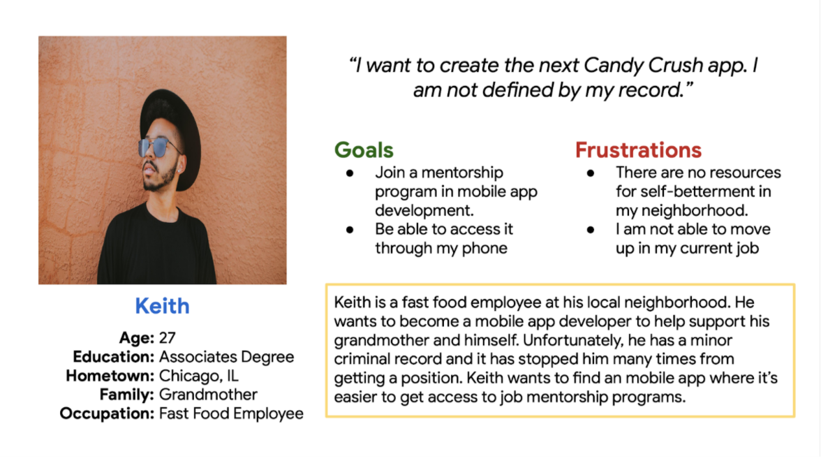
Keith is a fast food employee who needs to join a career mentorship program because he wants to become a mobile app developer despite his criminal record.

Chad is an unemployed husband and father
who needs a career mentorship program
because he wants to become a carpenter to support his family.

competitive audit
looked into Bain & Company, & Caterpillar (the indirect competitor), and From Prison Cells to PhDs (the direct competitor). I mainly focused on the direct competitor.
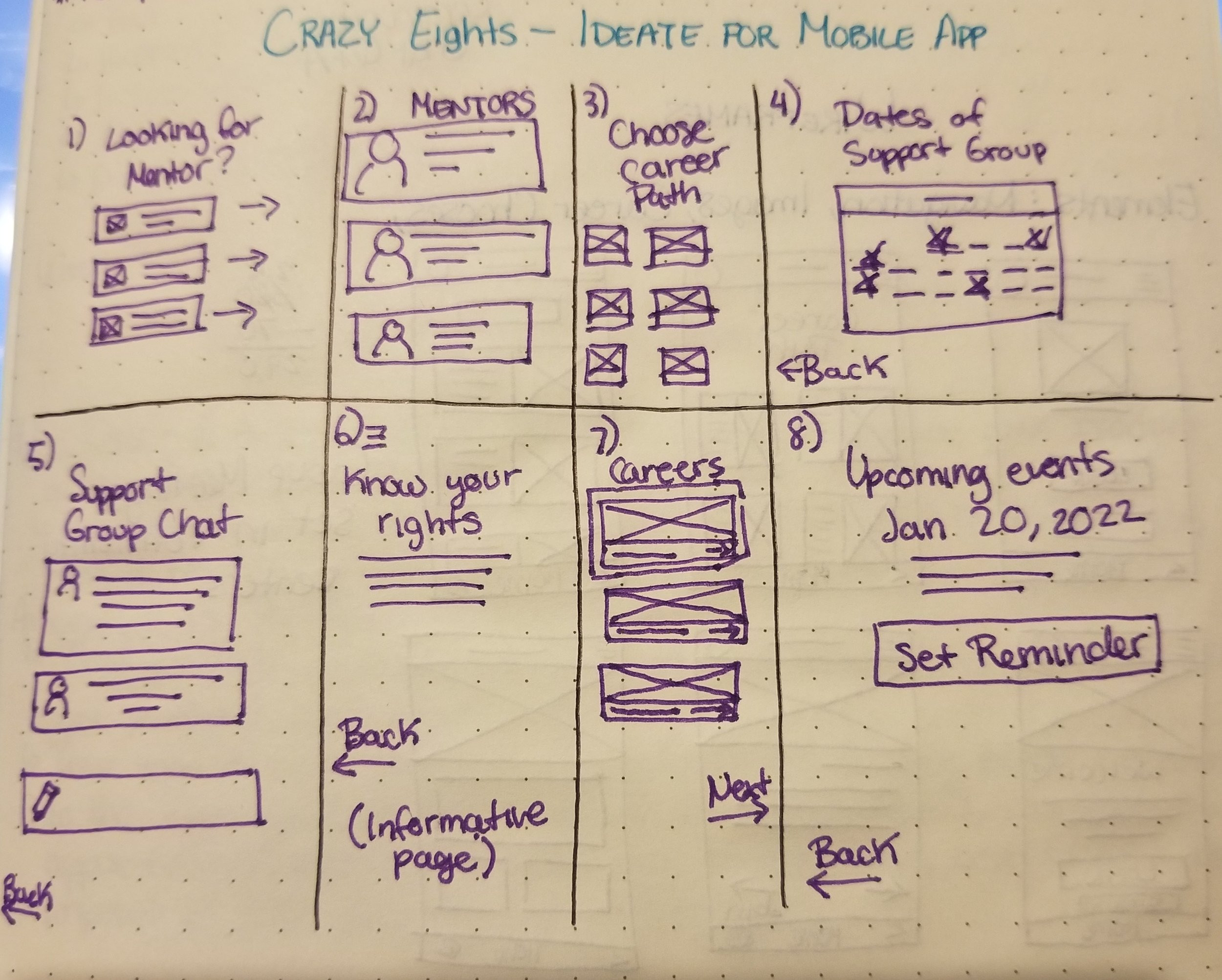
ideation
General ideas for the layout of the mobile app using Crazy 8s
Starting the design

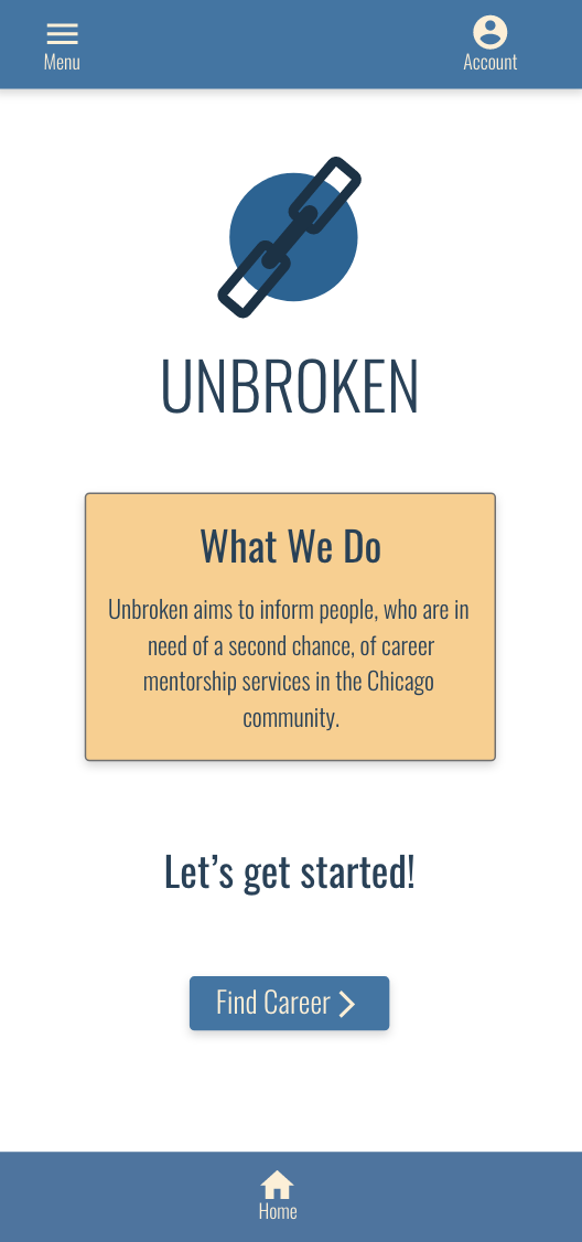
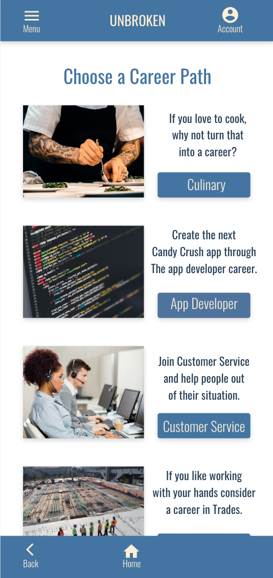
Digital wireframes
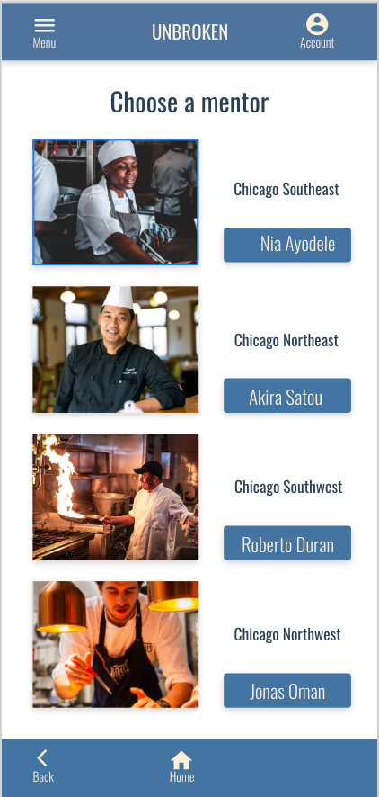
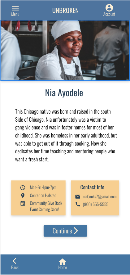
Here is the homepage for the dedicated app

low-fidelity prototype
On the right is the basic wireframe for the dedicated app and below is the link to the working prototype all on Adobe XD
Usability Study
Location
USA, Remote
Length
30-60 minutes
Study type
Unmoderated Usability Study
Participants
7 Participants
Findings
“Why is the logo a chipped cube when the name if the app is called ‘Unbroken’?” -Participant A
“I don’t normally see the settings button at the bottom of the screen with the home button.” -Participant D
“I would close this app immediately because of the choice of words. I feel like this meant for a kid.” -Participant F
Refining the design

mockups
The logo changed to have a chain instead of the cube.
And I changed the wording in the app.
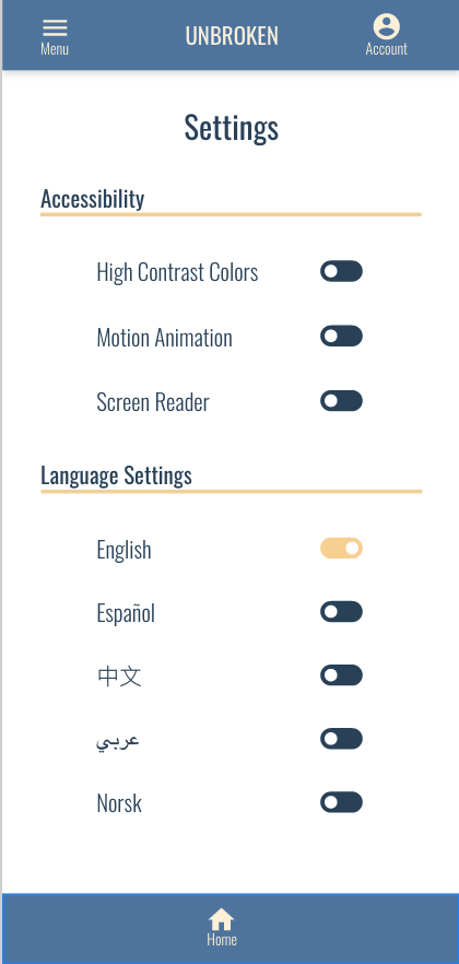
Accessibility Considerations
I incorporated buttons for high contrast, motion animation, screen reader and language settings.
Under the icons, I included the names of the icons in case the user didn’t know what they meant or what purpose they serve.
Responsive Design

Sitemap
Here is the general flow of the website where in this case i incorporated the feature for a user to promote their organization through the website.

Responsive Design
Mobile Screen
Responsive design
Tablet Screen

responsive Design
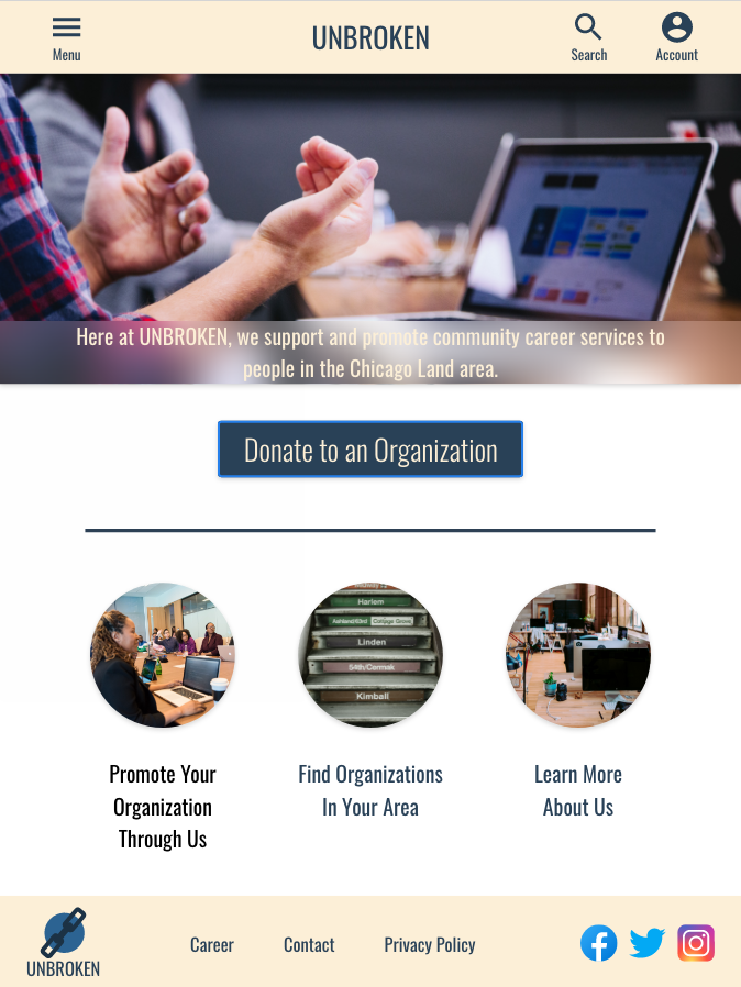
Computer Desktop Screen

Responsive Website Prototype: Mobile
Although it was not a requirement, I went ahead and created the mockup wireframe (on the right) and the prototype (below).

Responsive website prototype: Tablet
I did the same thing with the tablet screen.

Responsive website prototype: Desktop computer
And also the desktop computer screen.
Going forward
Impact
“I love how it looks and feels! You are able to use the app and get involved even though you don’t have that background.” -Participant G
what i learned
I finally learned how to create drop-down menus in Adobe XD. It was both fun and a challenge. I would love to continue learning to make better prototypes in future projects and get better feedback on my designs once working with a team of fellow designers.
Next Steps
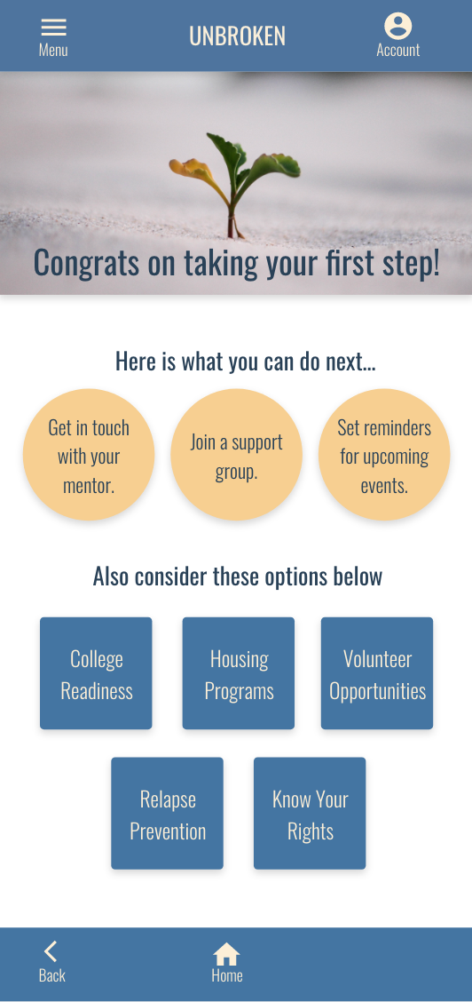
The next step would be incorporating links in the app to lead the user to Housing services, College Readiness, etc. The app feels unfinished if there are no links incorporated on that last screen.
Design the Find Career Mentorship page for the responsive website. The website needs to help the original target users.
Fix the drop-down menu of the responsive website prototype for the computer screen. Both dropdowns appear at the same time when it should show one drop-down menu.
Thank you for spending your time looking at my work. Please feel free to browse through the rest of my portfolio.