
Case Study: Take Me Home
By: Jacqueline Barragan-Abed

Take me home: The pet adoption app
A case study project required in the Interface Design Course for Northwestern University
January 2024- March 2024
Overview
problem statement
Cat and dog shelters are becoming increasingly overcrowded with current pet owners failing to spay and neuter their animals. The increased birth rate of animals becomes too much for local animal shelters to handle. This is a problem because these animal shelters are relying on kill shelters to euthanize the strays to control the population and be able to make room for other strays. We need to implement a system for potential adopters to adopt their perfect pet from these animal shelters to decrease the population of animals going to kill shelters.
goal
The goal is to create an app that will match users to their perfect pet to minimize the population of stray animals going to kill shelters and increase the rate of adoption in both animal shelters and rescue facilities.
target audience
The targeted audience for this app is those 18 years and older who are looking to add an addition to their family and are capable of caring for a pet.
introduction
Take Me Home is an app that will allow the user to look for adoptable pets in their local area, specifically from animal shelters and rescue facilities. In the app, the user will be able to take a compatibility test that will match them with 5 pets from a facility near them. They will be able to complete a different compatibility test to foster a pet if the user cannot commit to the full-time responsibilities of caring for a pet. They will also be able to volunteer or donate to the animal shelter of the user’s choosing. And finally, they will be able to gain access to post-adoption resources. Resources such as pet training tips, pet supplies, medical support, and sitter options.
process
research
In conducting a thorough competitive analysis, I sought out other apps and companies that offer similar features to the ones I am exploring for my design. As I delved into my research, I first examined the well-known animal shelter, PAWS Chicago, which is renowned for its mission to assist homeless animals in finding their forever homes. To my surprise, I discovered that PAWS Chicago does offer a compatibility test to match users with a pet to visit in person. However, since only one pet is suggested, there is a risk that the pet may have already been adopted by the time the user schedules their appointment.
Next, I looked into a similar organization called One Tail at a Time, which shares the same mission as PAWS Chicago. In exploring their site, I found that they place more emphasis on donations to support the care and maintenance of the animals in their shelter. While this is admirable, it made it somewhat challenging to navigate the site to find alternative options for fostering.
Finally, I examined an app called Petfinder, which allows users to search for pets of various sizes, from horses to exotic rodents. Petfinder is a direct competitor as it utilizes a filter to match users with the pets they desire. The app also suggests recommended pet food based on the pet’s species and age. Although the filter is effective in finding what the user wants, it doesn't take into account the compatibility between the user and the pet, which is essential for a successful partnership.
problem exploration
From the two companies and one app that I explored, I was shocked that there weren’t many resources to help users after they adopt their pets from the shelters. There was a lack of resources provided to people that would help them raise healthy pets. With this insight, I can use this in the app to fill in the gap. I would include four main categories of information that should help fill in the necessary information the users require: pet training tips, pet supplies, medical support, and sitter options.
design iterations
navigation & readability
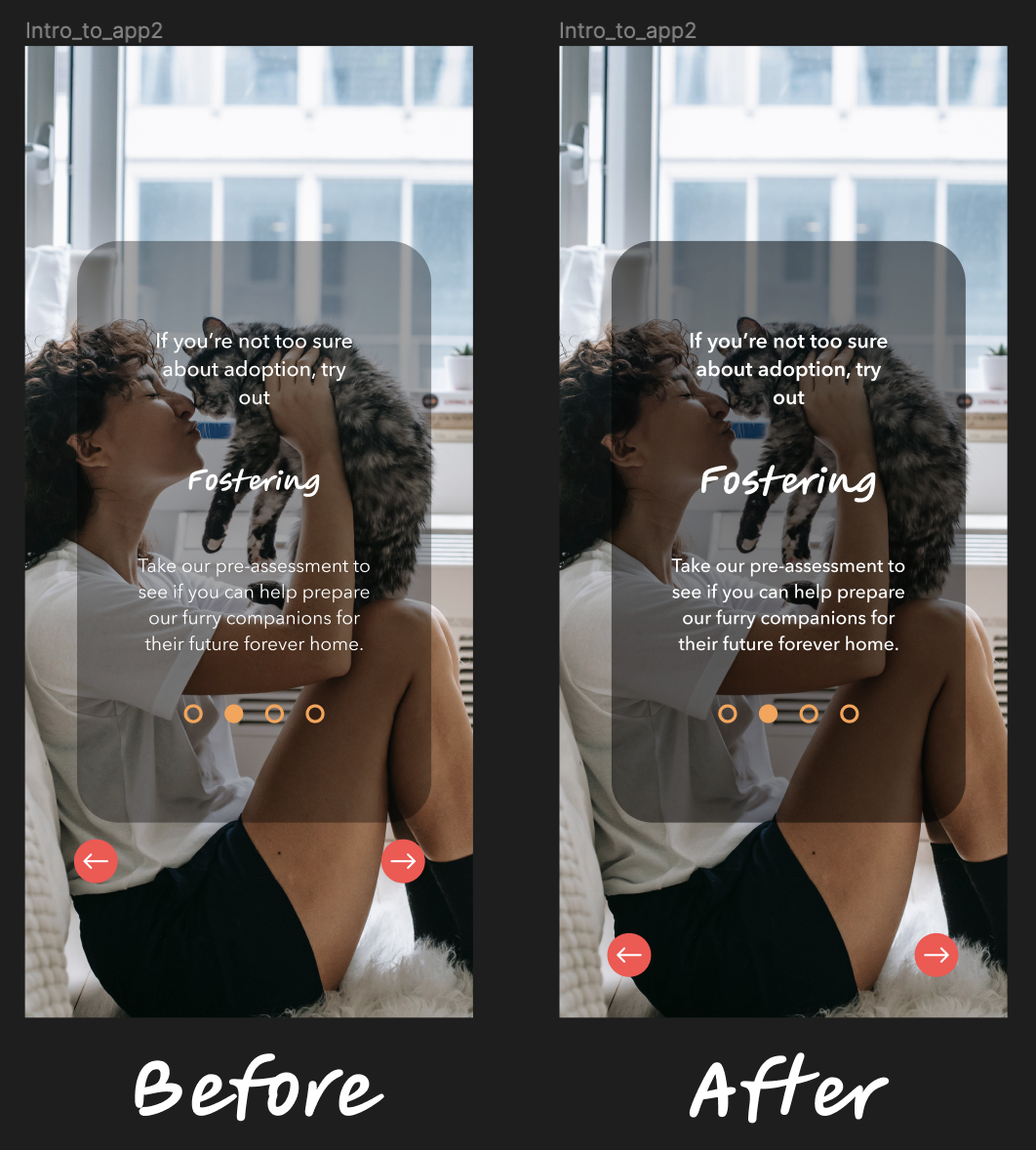
What was discussed in the usability studies is the need for the readability of the text. The majority of the screens are difficult to read because of the size and weight of the text. The image to the left shows the before and after of the changes made to the screen. On the left was the original design and on the right was the new design with the changes of darkening the background and adding more weight to the text. I also lowered the navigation buttons because a couple of the usability testers have mentioned that it looked awkward that all the text and the navigation buttons were bundled up in one area.
consistency

The second image to the right is about a comment from one of the usability testers. They wished there was more consistency with the color of the buttons and the shapes of the containers. I considered that with the redesign where I changed the size of the buttons so that its size ratio make sense to its wireframe. I also rounded out the corners of the wireframes to keep them consistent with the button shapes.
final design

Mockup photos if the app were to go live
next steps
The Donations and Volunteering section is the next priority for the app. It will feature a comprehensive list of animal shelter facilities, complete with their name, logo, location, and mission statement. To enhance user experience, a manual search section will be added, where users can easily find other locations by city or zip code. The app will also allow users to send donations and view volunteering events at specific animal shelters.
The next step is to develop subcategories for the Post Adoption Resources section. This involves creating wireframes for Medical Support, Pet Supplies, and Sitter Options, and then working on the content. This part of the process will take some time, as the app aims to provide a wealth of resources. However, it is not the top priority, as the previous step must be completed first to make the app functional.
Lastly, the app will focus on the foster section. A unique compatibility test will be created to ensure compatibility with foster pets. As fostering a pet requires different requirements than adopting, the interface will reflect this. Once a user is matched with a foster pet, the app will display what the interface will look like.
lessons learned
It was enjoyable creating the app based on a topic that I am interested in and throughout the process, I learned many things. One of them is the importance of user feedback from usability testing. It becomes difficult to continue working on a project where you as the designer feel like you are making the right decisions for your audience, but that may not always be the case. Staring at the same wireframes for more than eight weeks makes you become desensitized to any possible user-friendly changes. After conducting the usability testing, it was great hearing from different perspectives on what works and what doesn’t work. The other lesson I learned was patience. There were many moments where creating a working prototype had become very stressful, but it turned out, that there were elements and steps that I overlooked causing those design elements not to work in the prototype phase. If I had taken the time to look through each plug-in, I wouldn’t have run to the conclusion that there was something wrong with the program.