Simply sweet bakery responsive website design
Simply Sweet bakery responsive website design
Google Career Certification in UX Design Project 2: Design Flow For Ordering a Cake on a Bakery’s Website
Project Overview
The Product
The aim is to create a responsive website with a user-friendly flow for users who like to order cakes online
Project Duration
September 2021-November 2021
The problem
Understanding components of what a website needs to be functional.
Finding the best website structure for a user-friendly flow
Learning how to use Adobe XD to create digital wireframes, mockups, and prototypes.
The goal
To create a user-friendly flow design to order cakes online through a bakery’s website.
My Role
Lead UX Designer and UX Researcher
Responsibilities
User Research, Wireframes, Mockups, Usability Studies, and Prototypes
Understanding the user
User research Summary
From interviews, and competitive audits, to making personas, to making journey maps, problem statements, and empathy maps; user-friendly interactions are very important to include for a great user flow experience. Things of this nature are better categorization and cake customization.
Pain points
Some bakery menus has no pictures to go along with the text. Users might not be knowledgeable of types of pastries solely based on text.
Users want options for possible cake designs.
Users were unable to pick what kind of cake filling, and frosting they wanted for their cake.
Persona
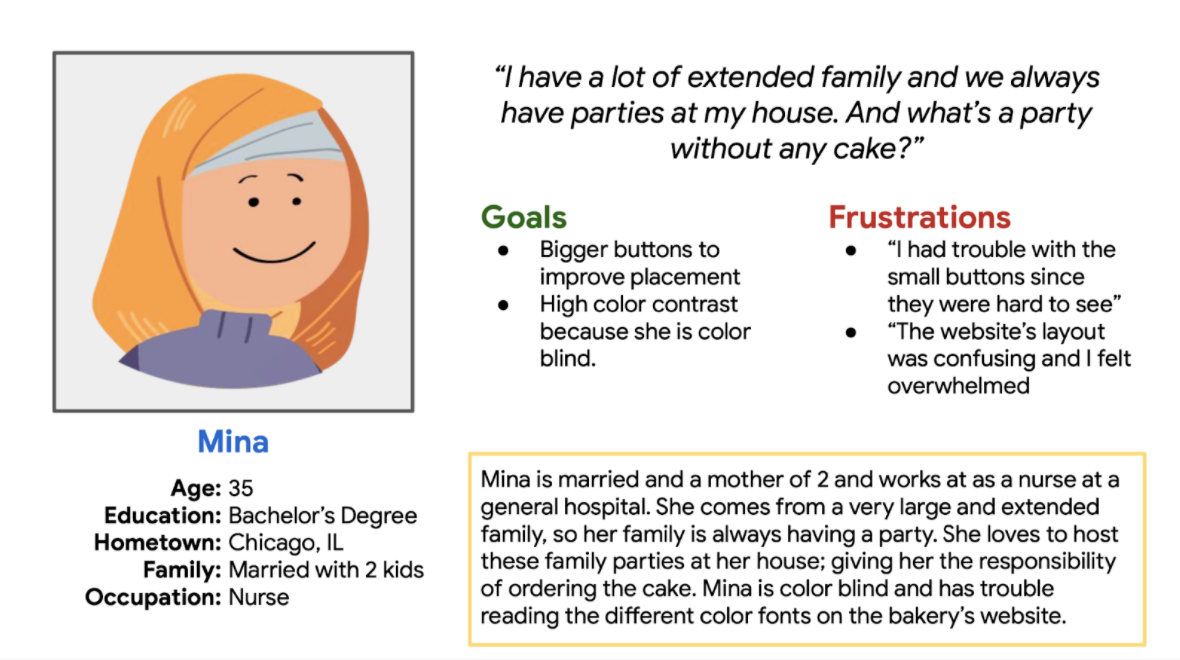
Mina
Mina is a nurse who needs to order a cake online because she does not have time in her busy schedule to stop by the bakery to order it in person.
User Journey map
becky
Another pain point that was not mentioned early on is creating an account while ordering a cake. This change will be incorporated in the mockups.
Starting the design
Before going digital
Sitemap
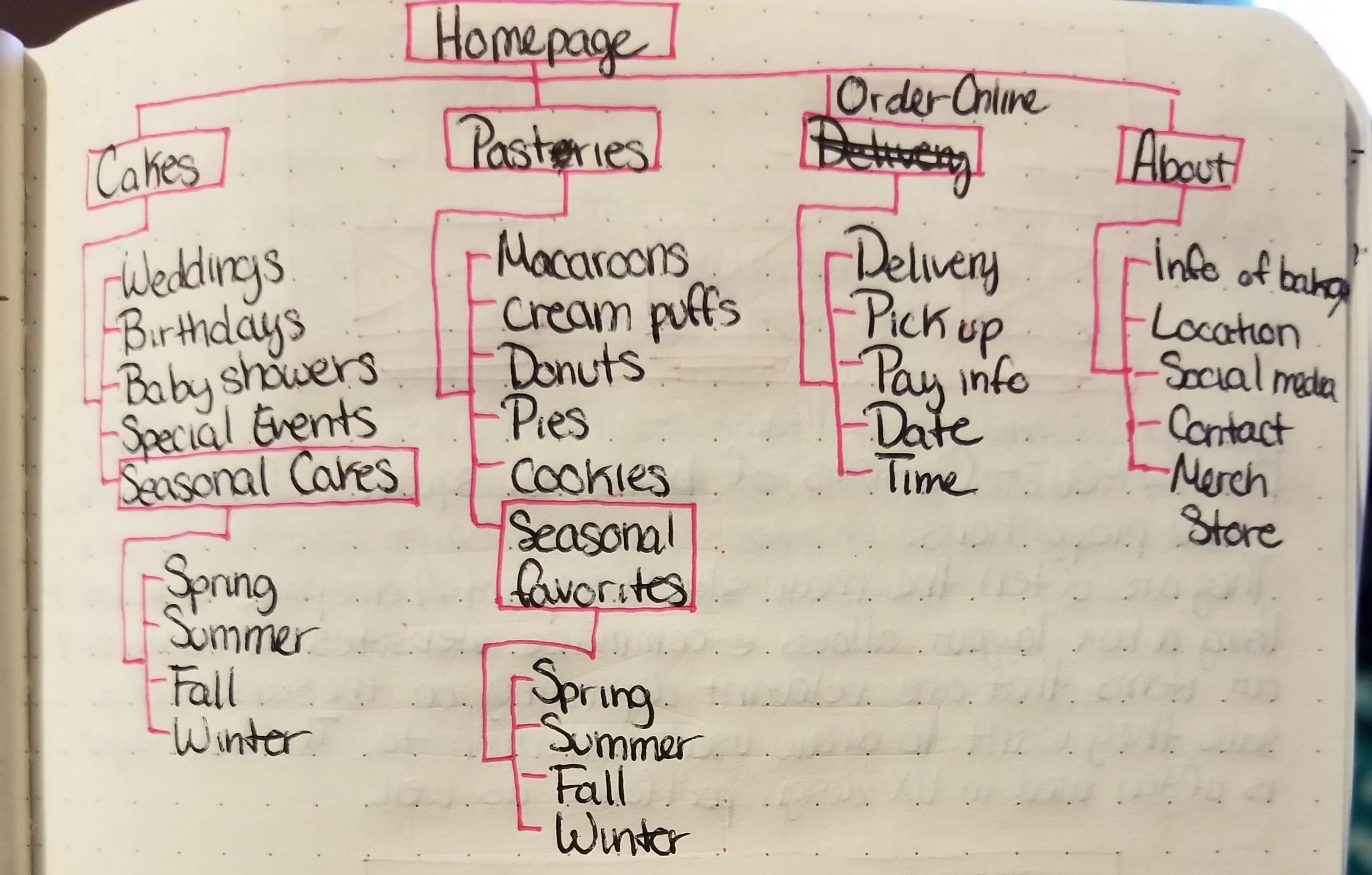
After looking at many different types of sitemap models, the hierarchical structure seems to fit this website best.
paper wireframes
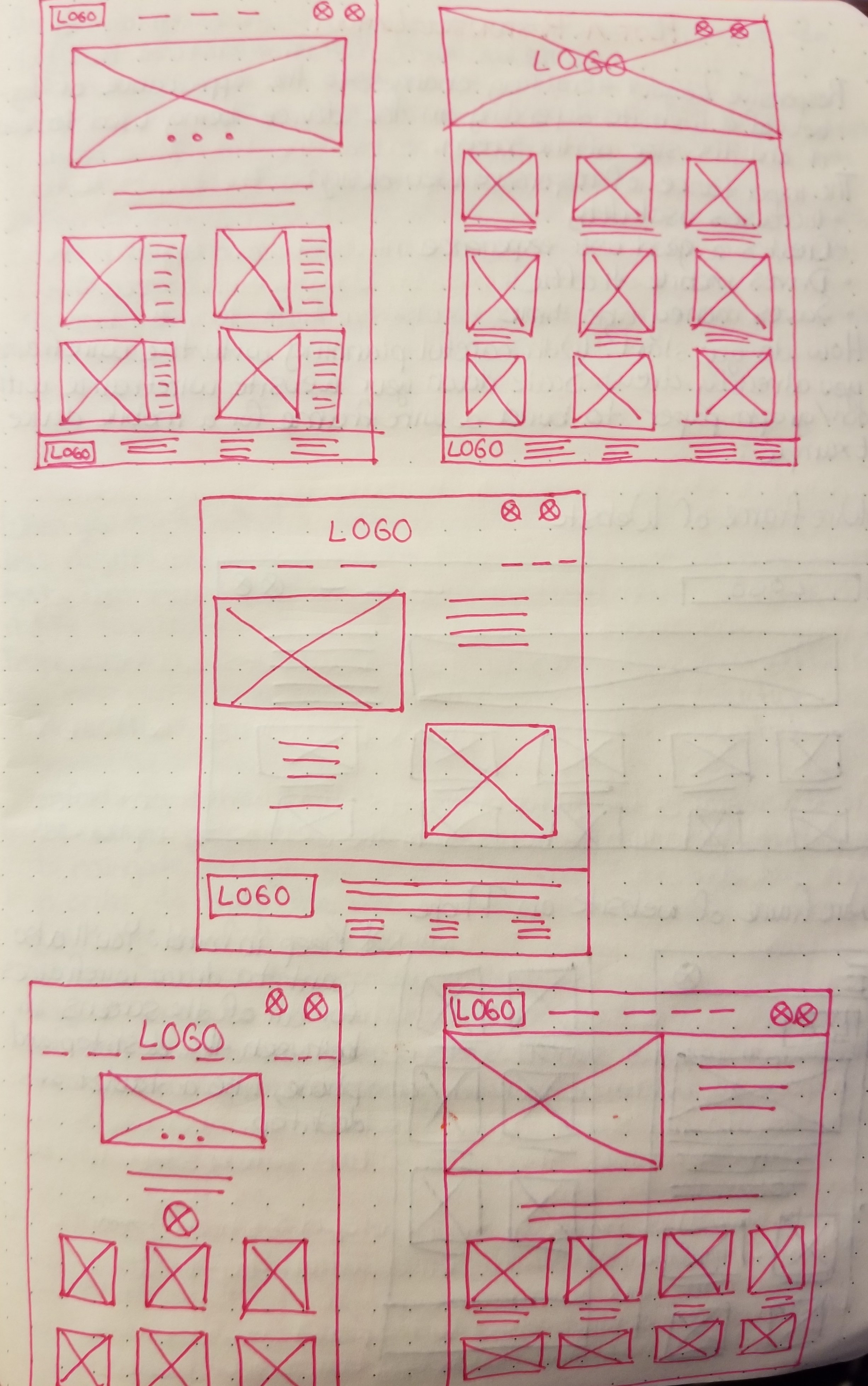
Here are five designs for a wireframe of the home page. The design on the bottom right was the one I decided for the final design.
paper wireframe screen size variation
Here is a quick sketch of the homescreen of the website on both a computer desktop and a mobile phone.
Wireframes and Low-fidelity prototypes on Adobe XD
Digital wireframes
From testing, users liked the task map to let them know how far long they are in ordering the cake.
Digital wireframe screen size variations
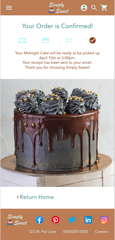
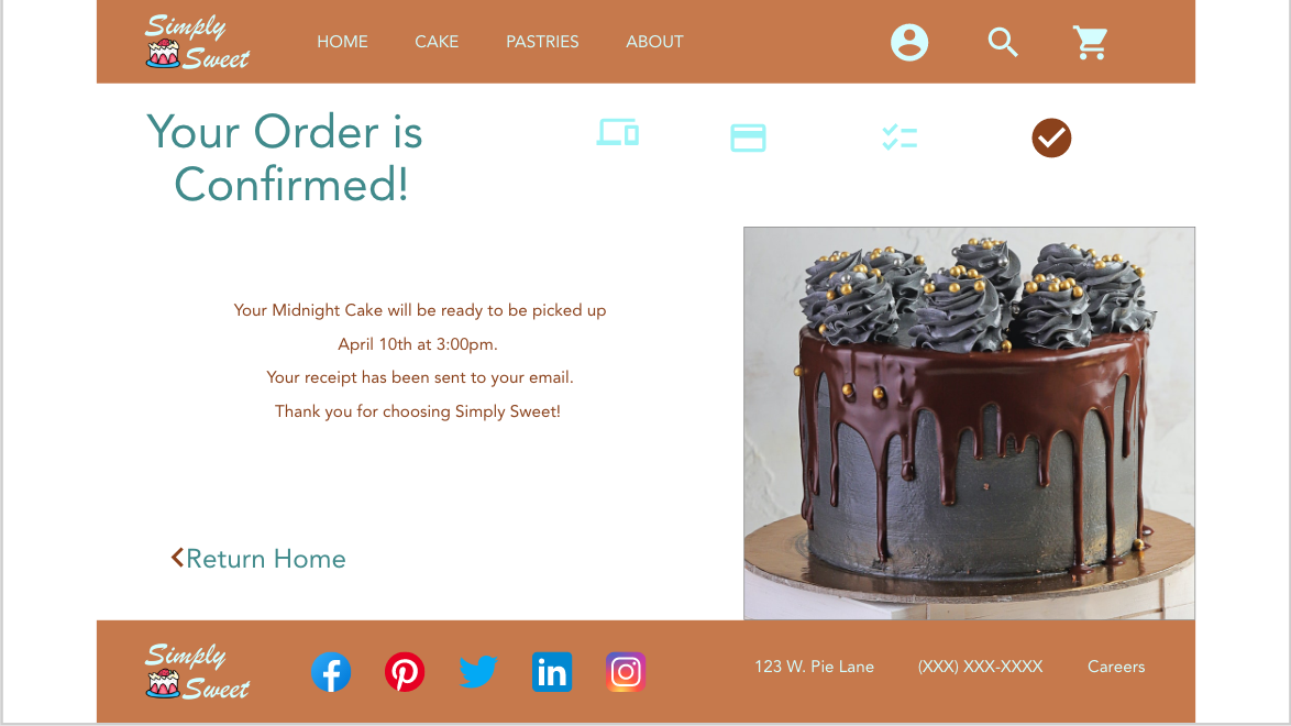
Here are the 2 different screen sizes for desktop (top) and Google pixel 4 (bottom). Both screens are showing the confirmation page.
Low-fidelity prototype
On the right is the full wireframe of the computer desktop and below is the link to the prototype.
usability study
Participants
5 participants
Length
20 - 30 minutes
Study type
Unmoderated Usability Study
Location
United States, Remote
Findings
“Love the task map!” - Participant D
“Do I really need to make an account to order a cake that I will order 3 times a year?” - Participant B
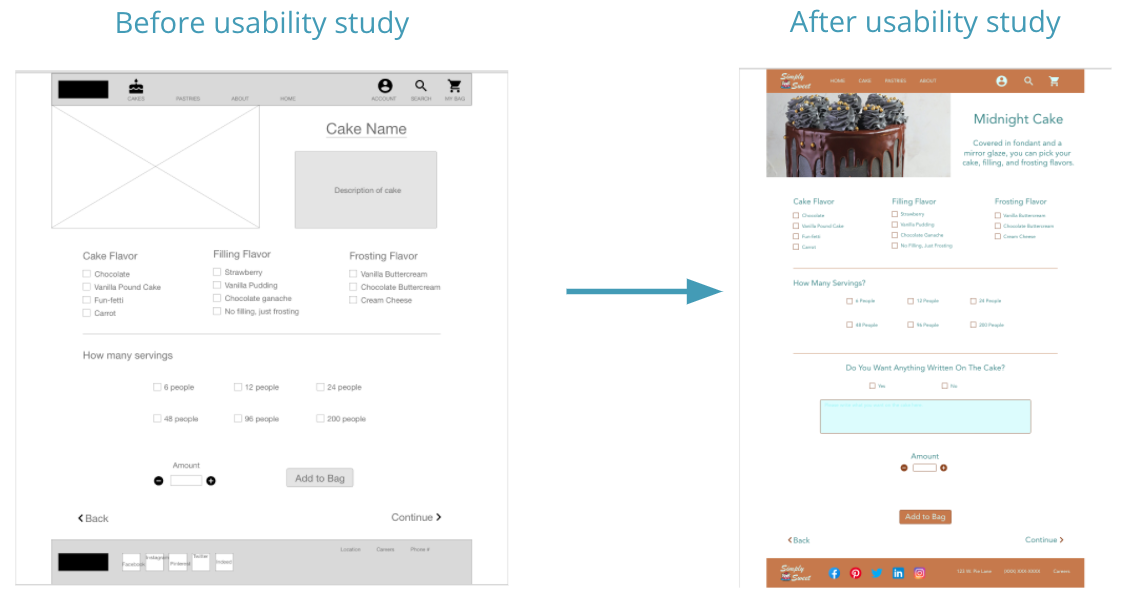
“Wait, where do I write my message on the cake?” -Participant E
Refining the design
Mockups
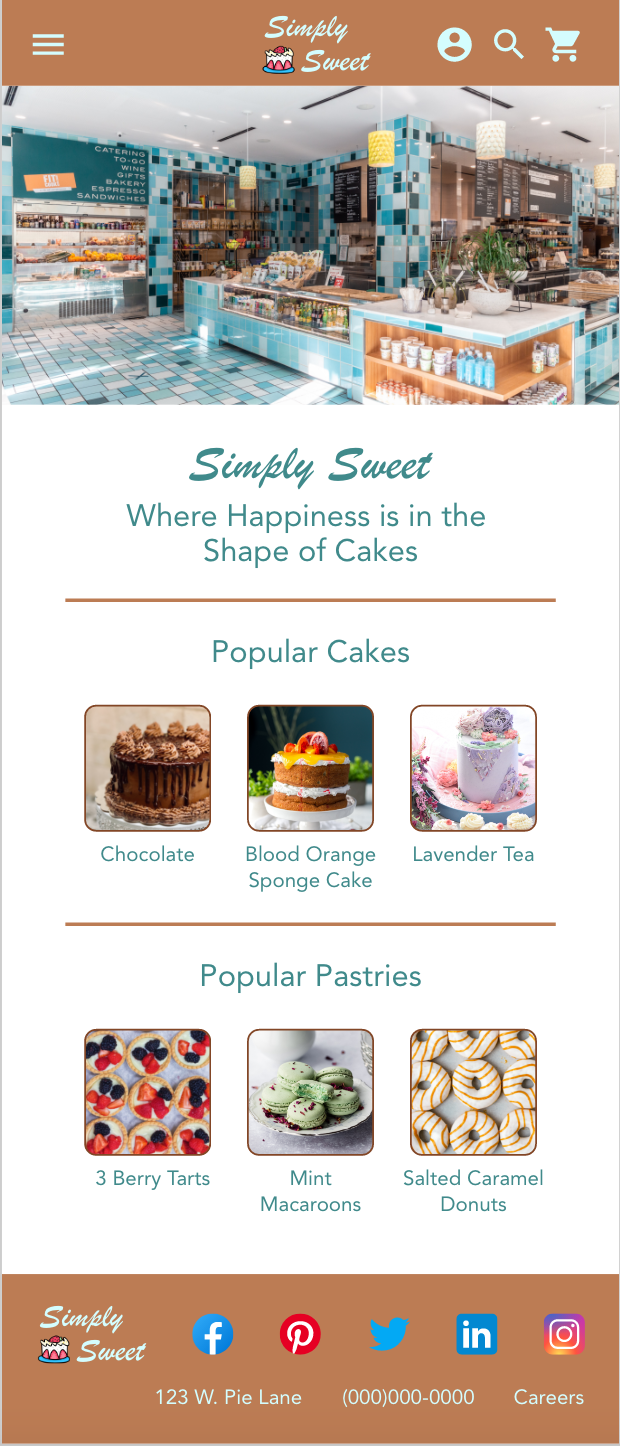
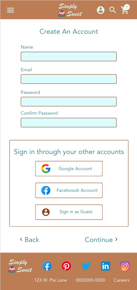
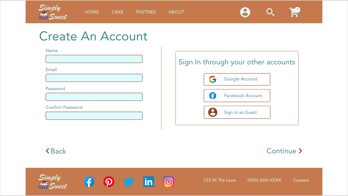
The end goal is to make the user flow easy to use and enjoyable. Here I incorporated the “Sign In as Guest” button for users who choose to opt out of creating an account.
More mockups
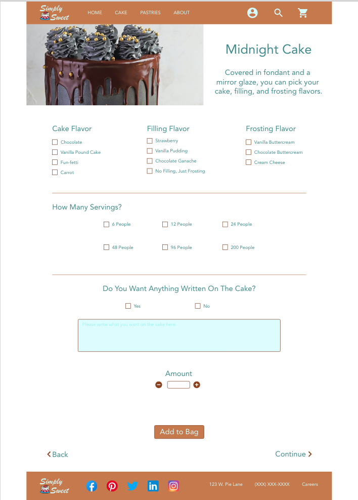
Based on feedback, I incorporated an option to write a message on the cake.
High-fidelity prototype
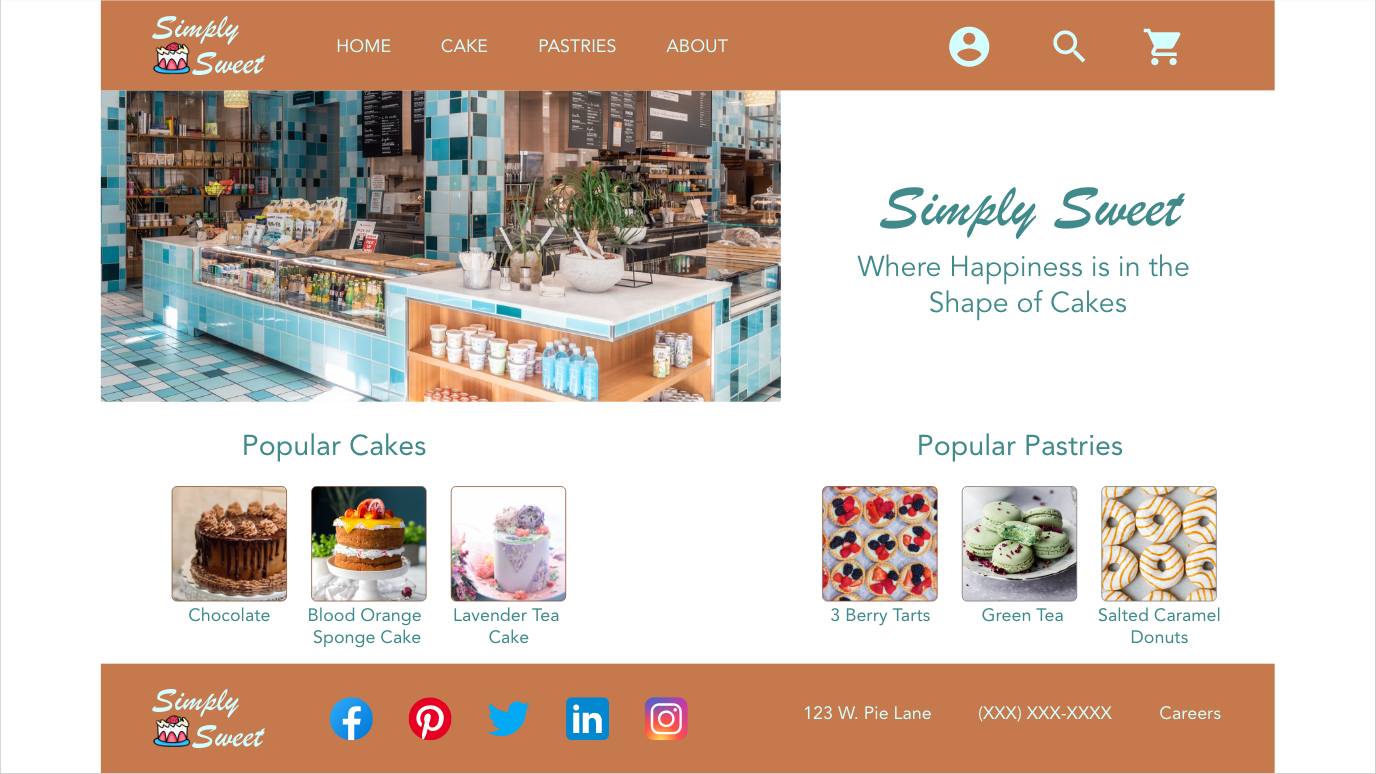
On the right is the mockup of the computer desktop screen and below is the link to the prototype.
Accessibility considerations
Color saturation was applied in the design for users with vision impairments.
A screen reader will be incorporated into the website just in case the color saturation is not enough for the user.
Motion animation setting was included in the design so that users can toggle between to add or get rid of the animation transitions.
Going forward
Impact
Working on this project made me realize to include the “sign in as guest” feature on the website. After including it in the final designs, I had a friend test it out and loved this option.
“It’s one thing less I have to do!” - Anonymous Friend
What I learned
Through this project, I learned to use Adobe XD and created a responsive website. I did make a lot of art boards to help with the smooth transitions of the project, but I am slowly learning how to create these interactions in the same artboard in Adobe XD.
Next Steps
Making items in the pastry web page clickable and open it up to a webpage where the user can add them to their bag.
Making the rest of the items in the cake web page clickable and open up to their own page where users can add them to their bags.
Include the web page to the About page and incorporate the Search button to be active.
Incorporate the interactions for selecting a cake in a single artboard.
Thank you for spending your time to look at my work. Please feel free to browse the rest of this portfolio.


