
Omakase app

Omakase Menu and Delivery app
Google Career Certificate in UX Design Project 1: Design a menu and ordering app for a fancy restaurant in Oslo, Norway.
The Product
The app I created is a menu and delivery app for a sushi restaurant in Oslo, Norway. My target audience are between the ages of early 20s and late 50s who order out more frequently.
Project Duration
June 2021-September 2021
The Problem
Addressing the organization of menu items to make it easy to read.
The Goal
To provide users with a simple and organized app that is easy to understand and navigate, have accessibility considerations, and the ability for the restaurant to receive feedback from the users’ meals.
My Role
Lead UX designer and UX researcher
Responsibilities
User Research, Wireframing, Usability Studies, Mockups, and Prototyping.
Understanding the User
User Research Summary:
I created a competitive audit comparing two well-known food delivery apps, GrubHub and DoorDash, and two fast food restaurants following the trend of menu and delivery apps, Mcdonald's and Panera Bread. Through this research, all 4 competitors had this in common: Up-to-date Geo Tracking deliveries, visual design, and menu categories. However, I was shocked to find that there were elements that needed to be fixed from these big companies such as better categorization of items on the menu, iconography, and lack of accessibility considerations aside from visuals.
Pain Points:
In most of the apps, there were no options for accessibility considerations.
The iconography in one of the apps was not universally recognized and did not match their label, making the user confused.
There are too many items that are repeated in each category section, making the user feel overwhelmed and confused.
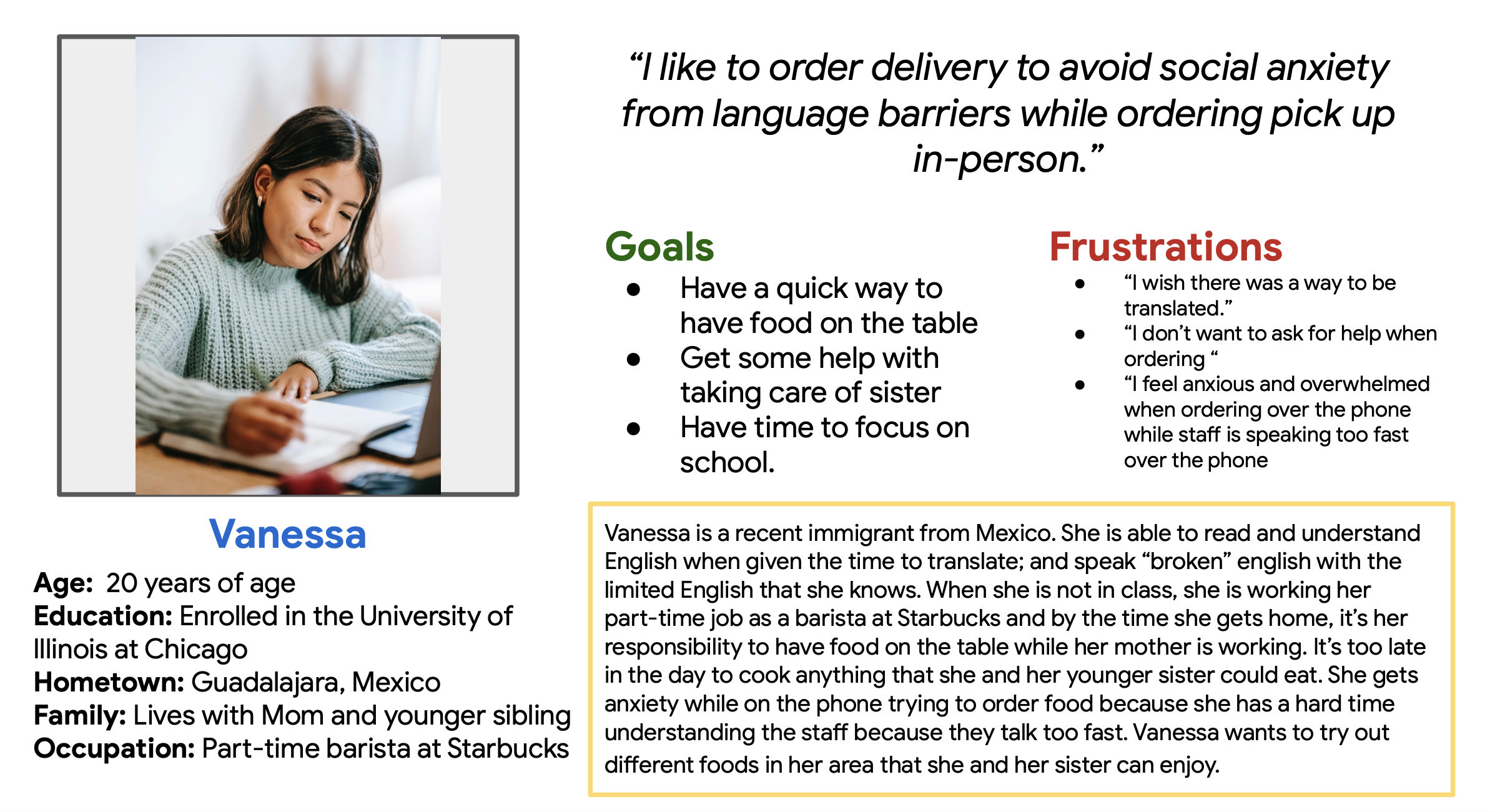
Persona
Vanessa is a full-time college student and part-time barista at Starbucks, who needs a quick and easy way to put food on the table to feed herself and her younger sister because she feels overwhelmed ordering over the phone due to her struggling understanding the language.

Persona
Lee is a full-time computer programer who needs a fast way to order healthier food delivery options because he needs a backup meal in the case his homemade meal does not go as planned.

Journey Map
Here is a quick journey map of Monica, a single mother of three children with food allergens.
Starting the design

Paper Wireframes
On the left are some layouts of possible designs for the digital wireframe. On the right is a quick sketch of the informative architecture of the app.

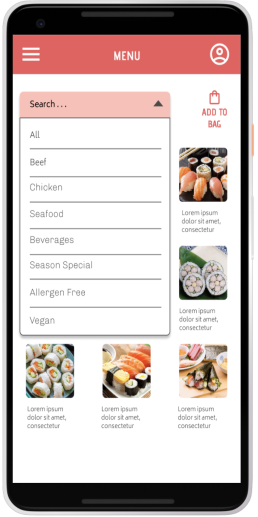
Digital Wireframe
Incorporating a filter to be a part of the menu was common based on the research done in the competitive audit.

Low Fidelity Prototype
This is an image of the completed wireframe and below is the link to the prototype.
Usability Study Findings
usability study summary
Based on research and feedback from the prototype from five participants, the overall reaction to the app was there were missing elements to make this app more user-friendly.
Round 1 Findings
Users need a delete button to take out unwanted items from their checkout bag.
Users need an add button to add food items to their checkout bag.
users need better cues in order to navigate through the app more smoothly without getting frustrated.
Round 2 finding
Users need to be able to delete one specific unwanted item from their bag.
Users need language options since this app is based in Norway.
Users need better cues to add things to their bags.
Refining the design

Mockups
Users at first were not able to add, delete, or edit their order. In the mockup, I made sure to incorporate it in the final design.
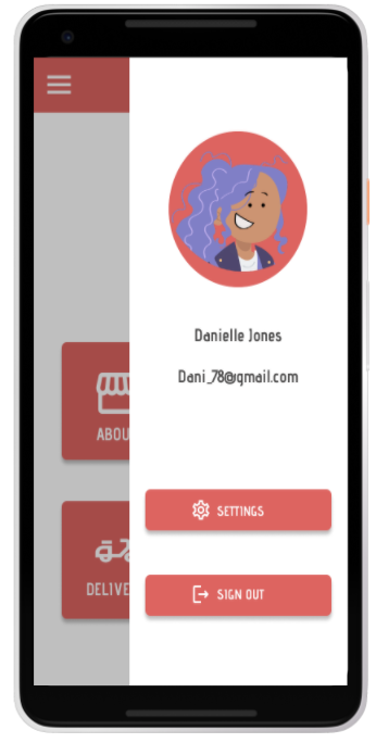
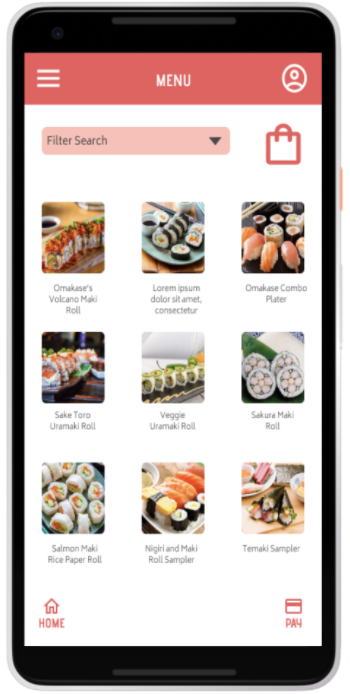
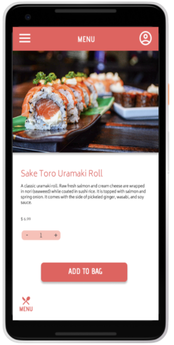
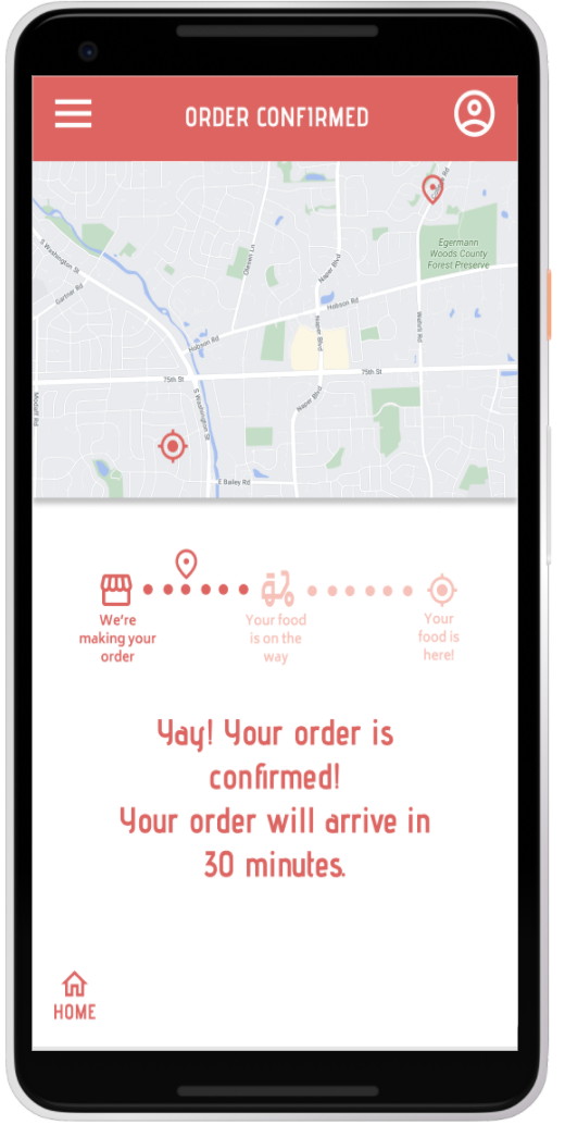

High-fidelity prototype
On the right is the mockup of the final design of the app. Below is the link to the prototype.

Accessibility considerations
1) Language option of the 4 most spoken languages in the world and the Norsk language since it is the main language in Oslo.
2) Screen Reader and High-Contrast Colors options are included for users that have trouble in seeing and/or maybe color blind.
3) Motion Animation setting was included to leave it on or turn it off for users.
Going Forward
Takeaways: Impact
The app makes users feel like the restaurant, Omakase, really thinks about how they can improve the experience of their clients the next time they order from them.
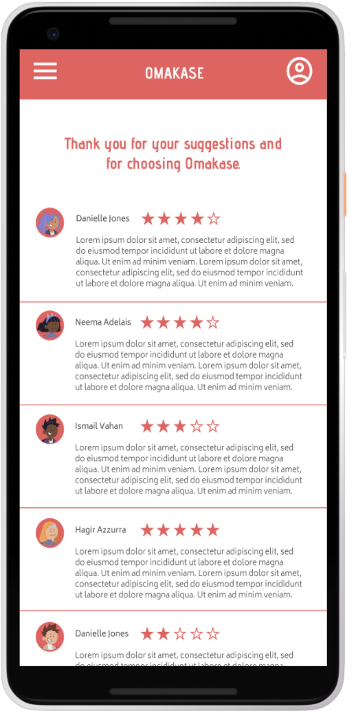
“I love that there is a rating section in the app. I would be able to leave feedback of my dinning experience of the restaurant.”
Takeaways: What I learned
This being the first project I worked on for the Google Certificate program, I learned to use a new design tool. I was able to create digital low-fidelity wireframes, high-fidelity mockups, and prototypes through Figma. I know my final design is far from perfect, but I am happy with what I was able to accomplish with this being my first time using this tool for a project and I can’t wait to use Figma again for future projects.
Takeaways: Next steps
For this app
Create a navigation footer for the app. After completing the project, I just now realized that I had forgotten to include that in the app as another option for the user to be able to navigate through the app.
Conduct another round of usability studies to validate whether the pain points users experience have been addressed.
Months later
summary
After a couple of months of completing the certificate, I decided to go back to this project and apply the changes the app desperately needed. I change the typography, button placement, screen size, and the logo. And I added a navigation footer. It is still not finished, but I am very happy to see my overall design procession.
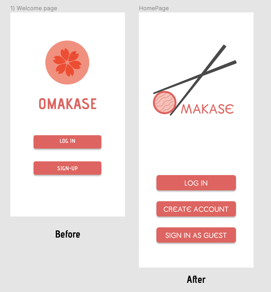
Updated login screen
At the start of the project I really did liked the original logo, but now looking at it more carefully, it looks like an app that will sell you tea. I played with the “O” to make it look like a piece of sushi being held by a pair of chopsticks to emphasize this app will sell you sushi. I also added an extra button to the login page for users that don’t want to commit to making an account and would rather sign in as a guest.

Updated Home Menu screen
Typography was changed, a picture carousel of seasonal specials was added to help users make a decision on what to eat. The bulky buttons are gone and are replaced with the full icons and text for a more sleek appearance. And the navigation footer was finally added!

Updated Menu item
Buttons are bigger and easier to read. The navigation footer was added for more options to move around from screen to screen causing less navigation frustration. Pictures are different, only because I added other menu items outside of sushi.
Thank you for your time in looking at my work. Please feel free to look at the rest of my portfolio.