
e-commerce website: Gente Bella Beauty Salon

Gente Bella Beauty Salon Inc.
Redesign the salon’s website and create an eCommerce website.
the product
Create an eCommerce website for the salon to sell their products while promoting the in-person services targeted towards women between the ages of 18 - late 60s.
project duration
July 2022 - November 2022
the problem
How are the local competitors selling themselves and their products?
What are some things that can increase traffic both online and in-person?
the goal
Create a user-friendly design flow for ordering products online.
Include a more robust gallery of all in-person services.
In addition, create a section for a blog on the website.
My role
UX Designer and UX Researcher
Responsibilities
User Research, Wireframing, Mockups, Usability Studies, and Prototyping.
Understanding the user
User research summary
Right away I conducted a competitive audit of the salon’s original website with its top 3 direct competitors in the area Amazon, and indirect competitors. From the results of the competitive audit, none of the local salons have an eCommerce website. However, two of the three did have a visual aesthetic that matched their branding, unlike Gente Bella. Amazon is a well-known eCommerce website with flawless user flow for ordering online and where people and businesses can list their products to sell. Because people can list any product, there is a chance that the user could buy a false product. Since Gente Bella would be the only business listing products to sell on their own website, there will be fewer chances for that to happen.
Personas

Meet sandra
Sandra is a mother of 2 and a flower shop owner. She is trying to find a way to purchase press on nails that are only sold at Gente Bella Beauty Salon without leaving her busy shop unattended.

Meet Nora
Nora is a college student that is looking for a shampoo and conditioner that treats colored hair. The issue is that she can’t find the specific shampoo at her local drugstores. She wants to look for a reliable website to order the hair products.
ideation
sitemap

Website’s user flow
Here was the general flow of the website and how the user would interact order products from the site, look at the gallery, and search for the information of the beauty salon.
Paper wireframes
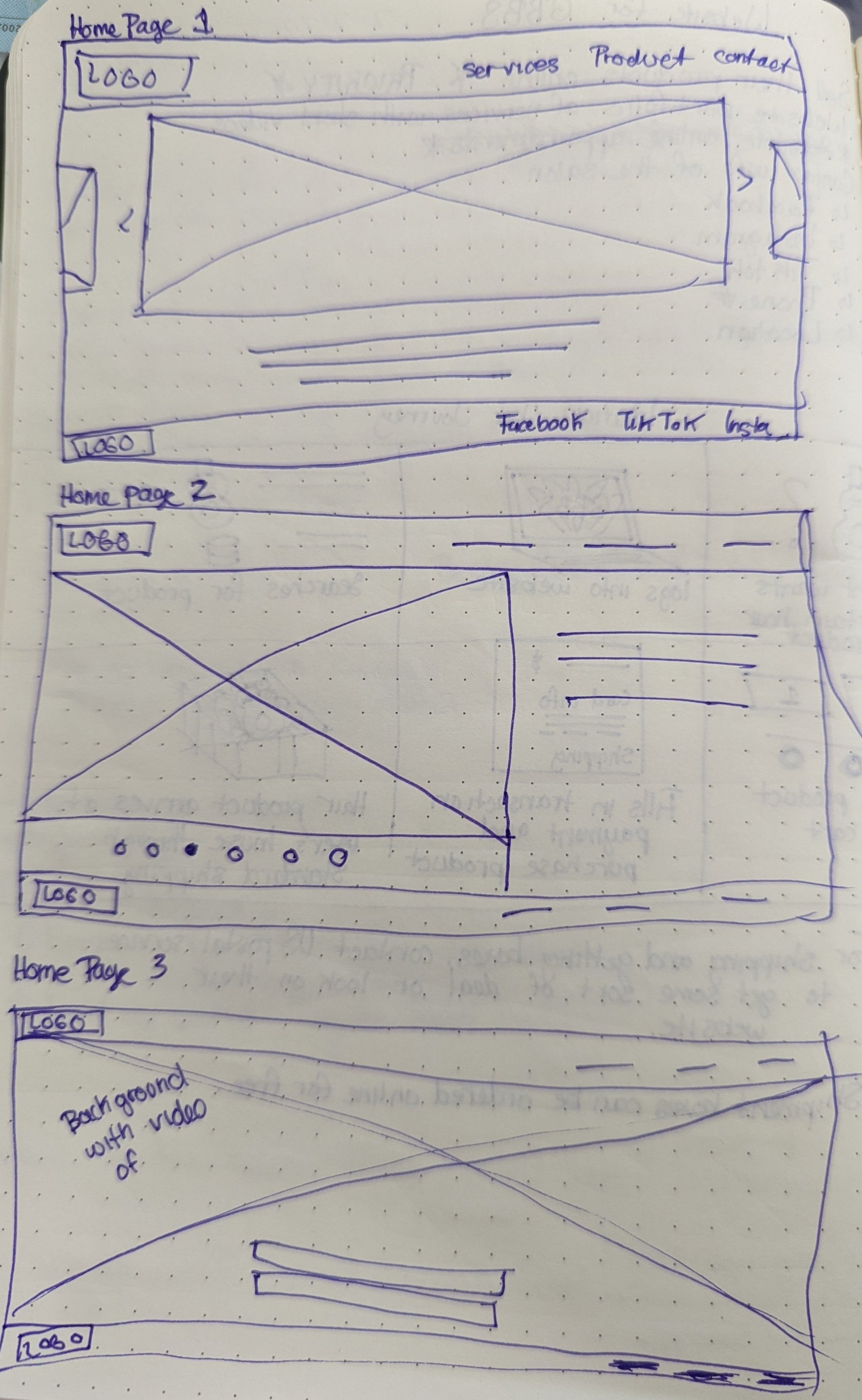
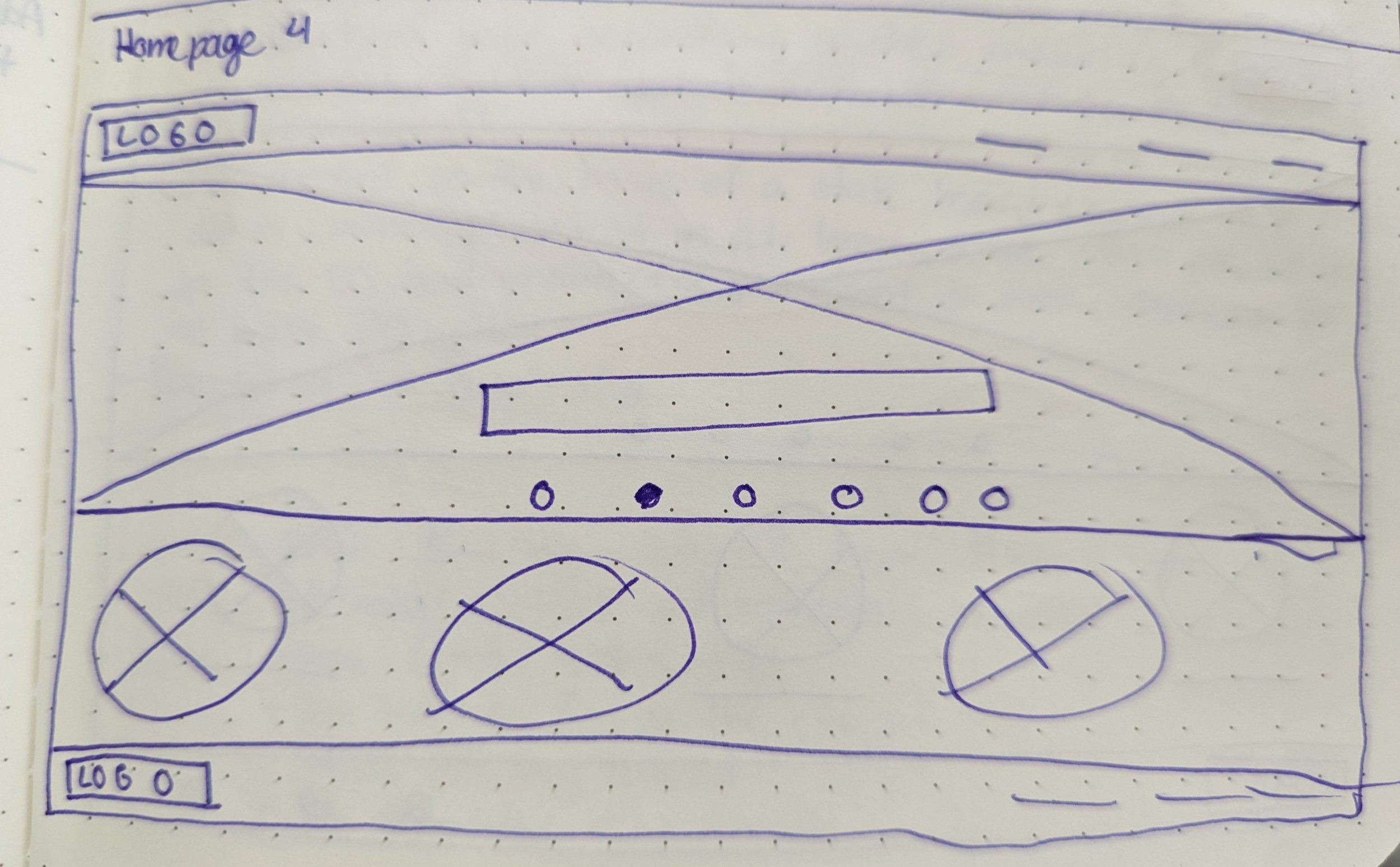
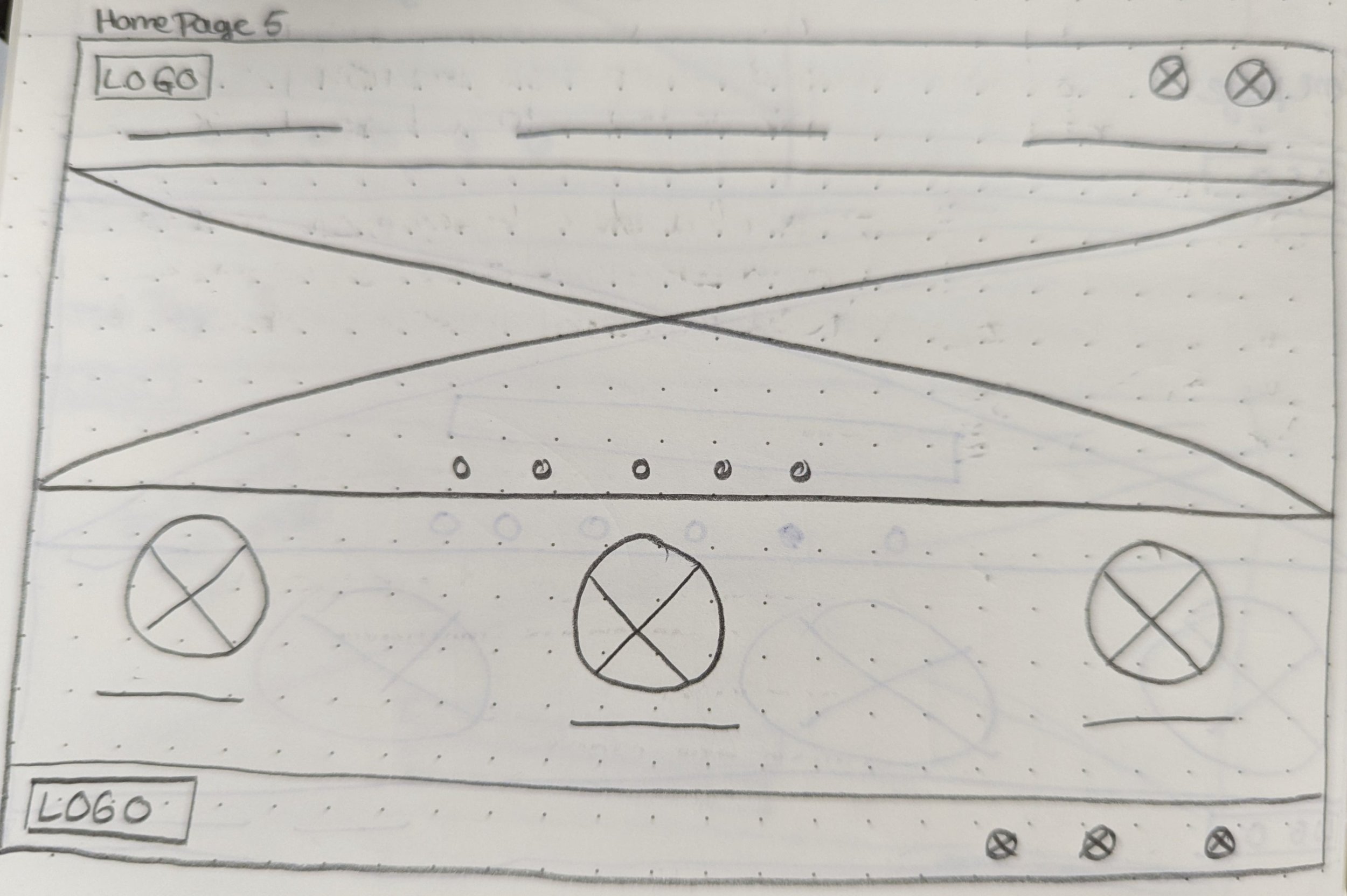
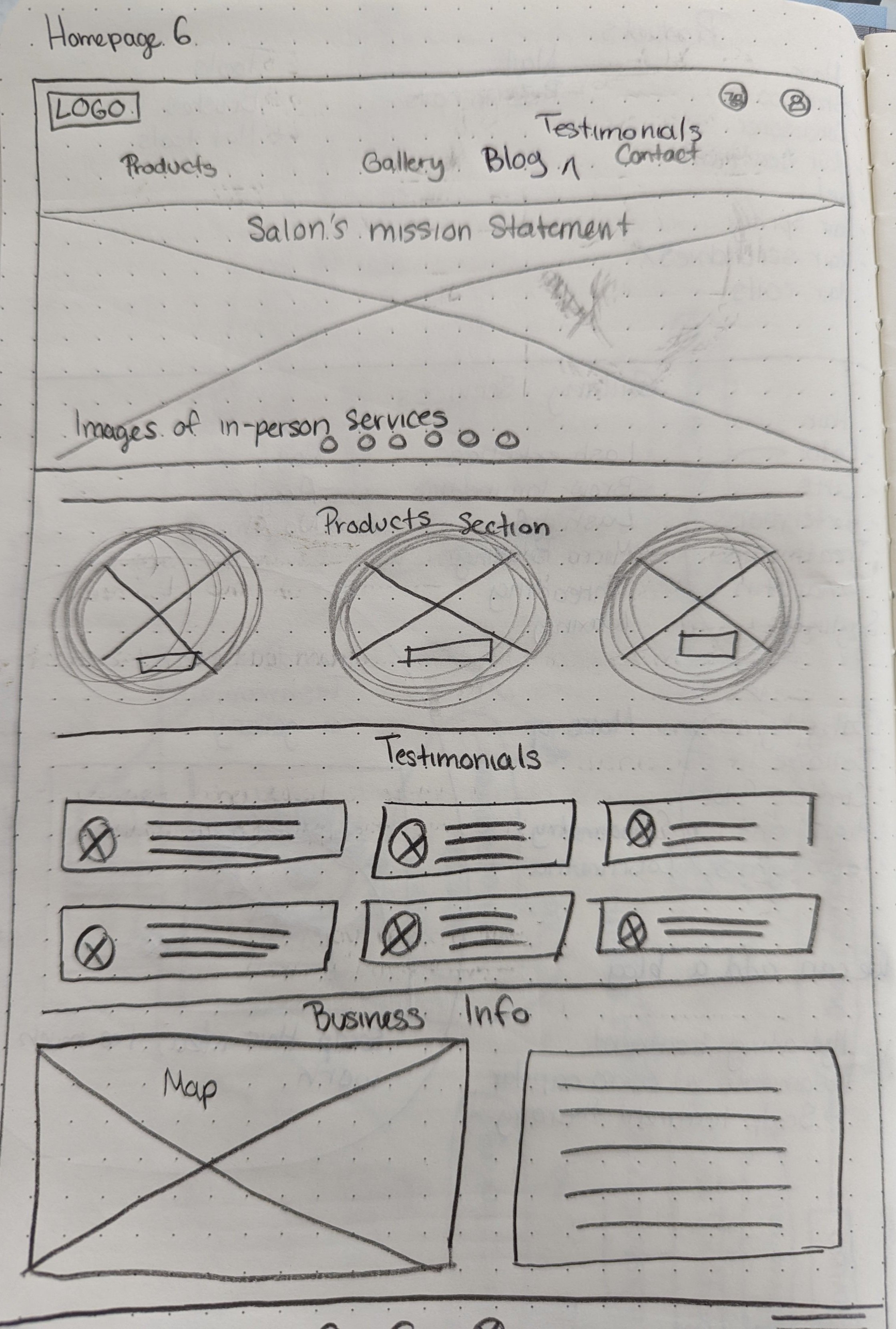
Here are six images of paper wireframes made for the home screen of the website. Homepage 6 was selected as the final concept design for the website.

Blog Paper Wireframe
Whatever it is, the way you tell your story online can make all the difference.
Digital wireframes on adobe xd

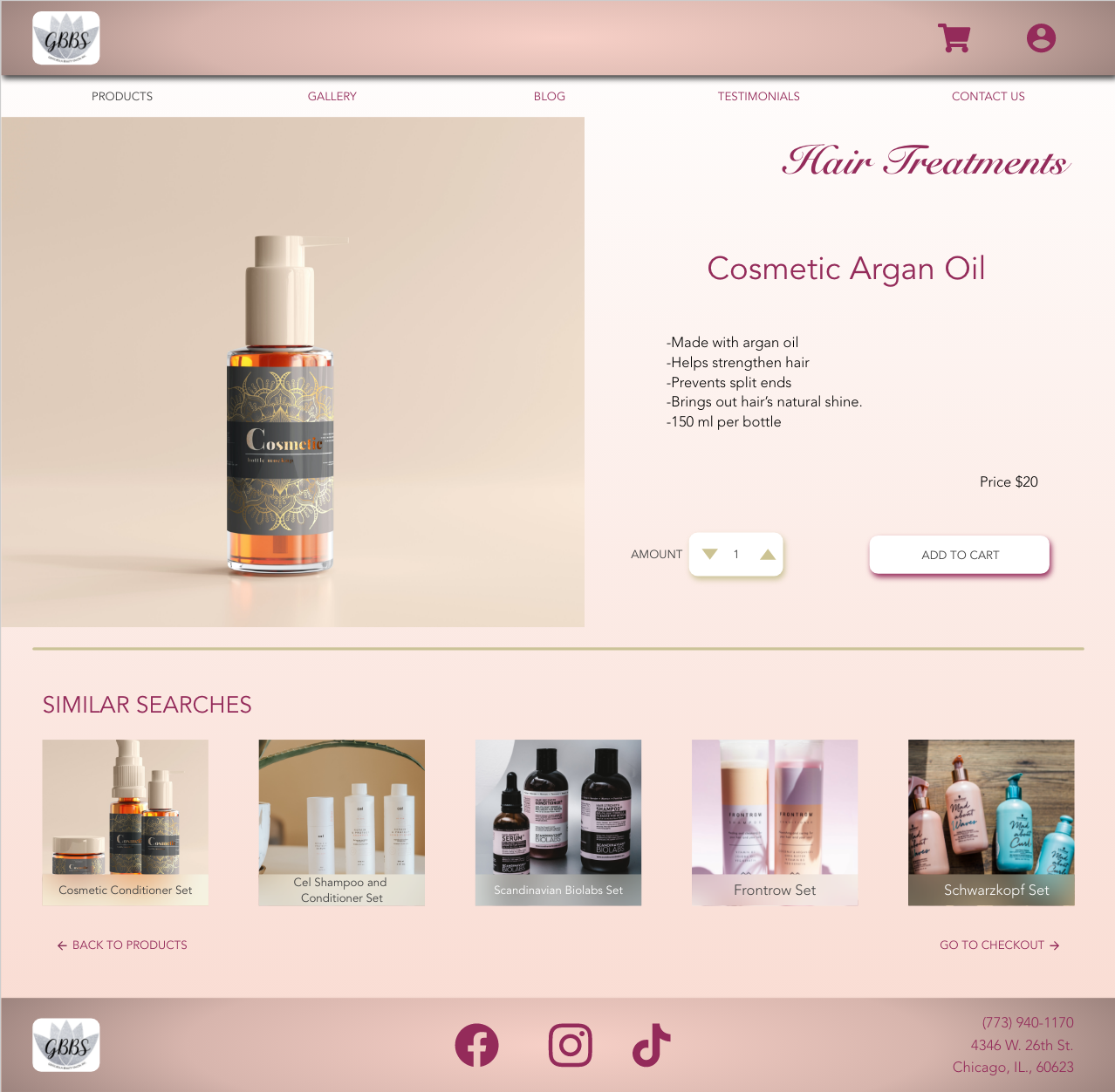
Product item page
Here the user will be able to look at the specific product in detail, how many they would like to order, add it to their cart, and look at similar products.

Your order page
Once the user places their order, they will be sent to this page as a confirmation that their order has been placed and will arrive shortly to them.

gallery page
This is the gallery page of the website where the stakeholders can upload photos of their work and will be organized by
Usability study
Location
Chicago, IL.
Length
10-15 minutes
study type
Moderated Usability Study
Participants
5 Participants
Findings
“I can barely see the product. The top menu bar is taking up most of the screen.” —Participant C
“The ‘Check Out Our Services’ page seems unnecessary. I don’t see why this would be needed when it’s going to take me to a page where I will be able to see all the services anyway.” — Participant A
“How come the ‘Testimonials’ and ‘Contact Us’ tab leads me back to the home screen and not the actual testimonials of other clients or a way to contact the salon?” —Participant E
Mockups

Home screen
This is Gente Bella Beauty Salon new home page. The first thing users will see is the carousel of images from work they have done. As they go down they can select from three categories that their products are divided into. Continuing down the screen will be another carousel of images with a list of in-person services the salon provides. Users can click these images and it will take them to the gallery. Going down to the bottom of the home screen are the most recent testimonials and contact information, business hours, and business location of the salon.
Make it stand out
Here is where the user will see in detail of the product they selected. The user will be able to put in the number of how many of this product they want and be able to put it in their bag. As the user scrolls down, they will be able to see similar searches of products and be able to navigate to the previous webpage or proceed to checkout.
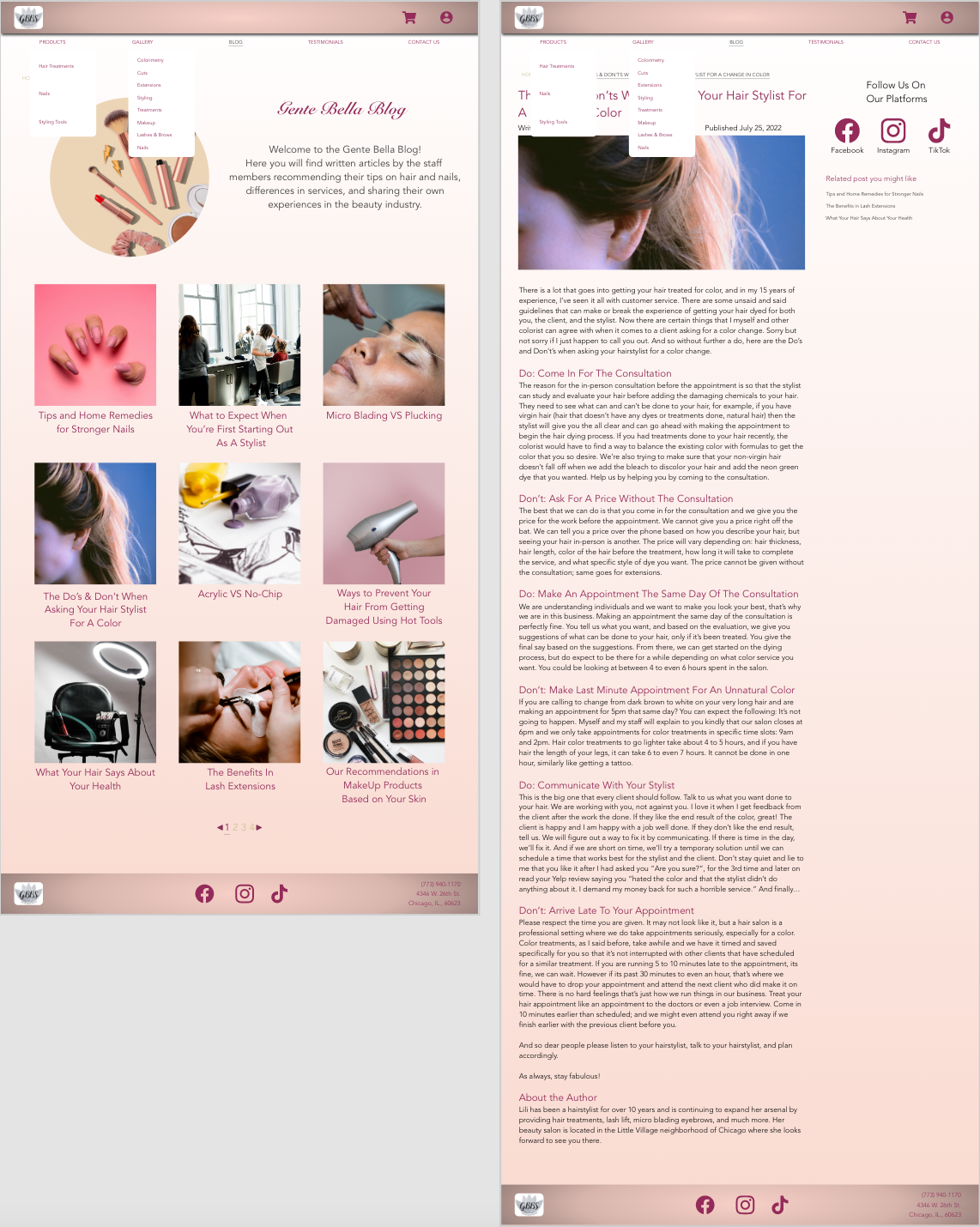
blog pages
On the left is the blog home page with a description of what users are expected to find. On the right is when a user selects the article they want to read and this would be the layout of the webpage.

Order confirmation page
With consideration from the user studies, the menu bar was condensed and the tabs are now outside of the bar. This makes the website feel less bulky and users will be able to see more of the website page without it being disrupted from the menu bar.

High-fidelity prototype
Access the prototype by clicking the button below.
going forward
Impact
The user will now be able to order hair and nail products from the comfort of their home. The stakeholders will be able to make two side incomes through the e-commerce website and through their blog.
what I learned
This being my first freelance job as a UX Designer, I learned quite a lot. During the process, I learned a lot about the clients and how to help them look for a product they need. However, during the process, I did neglect the stakeholders on how they would approach their website to include promotions, update their product prices, add new products, remove products, let clients know of certain products that are out of stock, upload their blog articles, the list goes on. There is more that needs to be done for the website to be usable for the stakeholders, but that will be more down the line.
Next Steps
The next steps in this project would be to design with the stakeholders in mind by:
Design a web flow of how the stakeholders would upload their pictures to the website for the gallery.
Design a web flow of how stakeholders would write and publish their blog posts on their website.
Design a flow of how the stakeholders can add new products, update products, and delete old products on the website.
Include the slide-out User Account and Cart. Those two would be a top priority in order to make it a working prototype.
Include a calendar set for the stakeholders to program how long they would like to promote a product sale or in-person service special.
As far as the prototype itself:
The Cart icon at the top right corner should include a number on the corner of it to indicate how many items there are in the cart.
Figuring out how to lead the “testimonies” and “contact us” tabs to lead straight to the bottom of the homepage.
Indicated that a small gallery on the homepage can be scrolled from side to side.
Thank you for spending your time to look at my work. Please feel free to browse the rest of this portfolio.